Icm Final Climate Change Api Wordcloud
07 Dec 2019 - Jake Sherwood
 ICM Final - Climate Change API Word Cloud
ICM Final - Climate Change API Word Cloud
Canvas of final work at bottom
For my ICM final, I wanted to make something I could incorporate into my PCOMP final.
My PCOMP final is a soundscape sculpture about climate change. It represents 4 potentail climate change scenarios, called Representative Concentration Pathways, or RCPs. Progressing from best case to worst case, if we do everything we can to fix the current situation or if we do nothing at all and reach the worst case.
I plan to have some additional info available via QR code and wanted some visuals to go along with it.
I really like the look and feel of the text manipulation word cloud exercise we did in class.
Wanting to have a changing dataset, instead of a static text file to pull from, I watched all the Shiffman tutorials on API’s and data.
The concept was to query the NYTimes API for articles about global warming or climate change and use the article abstracts as my dataset.
Connecting to the API was relatively straight forward and I had a test up and running pretty quickly.
The question now was how exactly to display the text.
I settled on the idea of working with occurrence of words, similar to what we did in the in class exercise.
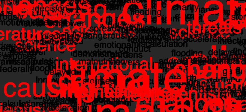
I wanted to have the words that occur more frequently display larger and red. Also, originally the concept was to have the red words stay on the canvas and have the black, less frequent words, disappear.
Once the screen was completely red, a graph displaying the RCP data would be drawn.
Discussing this with a classmate I kind of stumbled upon a happy accident.
I was showing them how the screen would fill up with the text. At that point I didn’t have the text built out as objects, so I was just drawing them without a back ground to illustrate the canvas filling up.
I’m glad I did, the contrasting red and black text filling up the canvas made for a really nice affect. It created a very chaotic and intense feeling and the higher occurrence of words like climate and changes and decline were still apparent as the canvas filled up.
I also played with still fading out the black text here. But eventually the red words become illegible and the original aesthetic of leaving all the text on the canvas seemed more powerfull.
Also, to prevent the browser from getting bogged down. I have a sanitizing function/if statement removing elements from the array once it gets to a certain length.
Final p5.js sketch link: https://editor.p5js.org/lucidprojects/sketches/QAcGoQoeE